Shoukang
Herbal Tea
Box Design
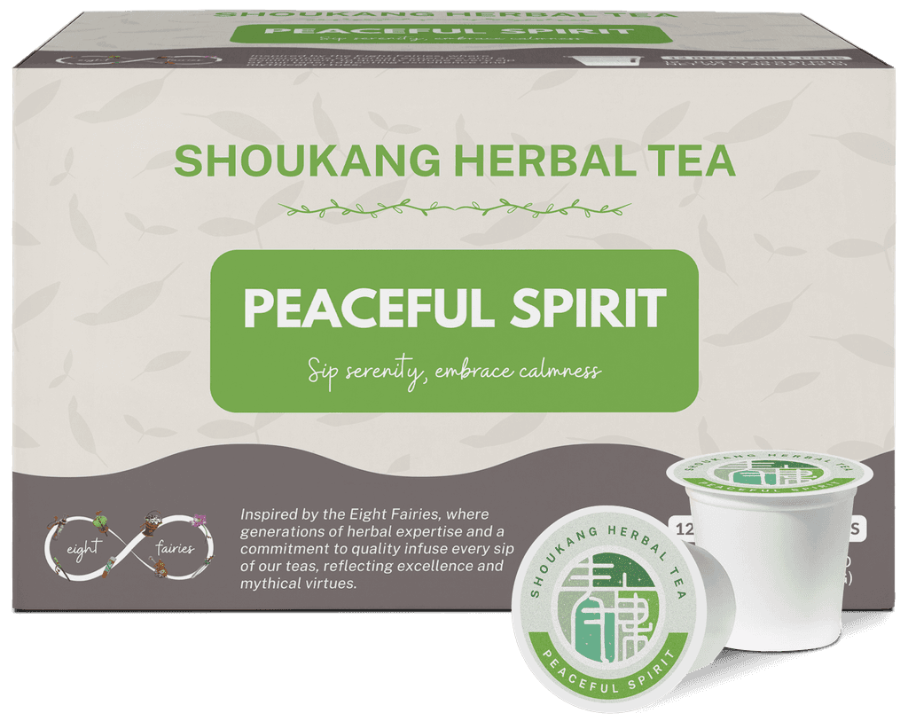
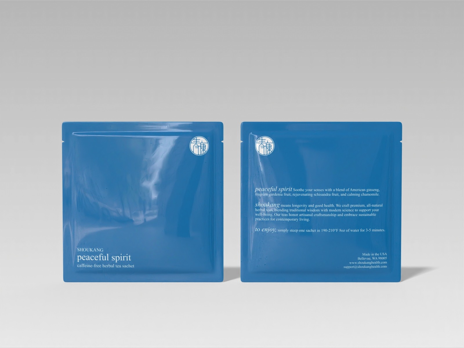
Shoukang, a brand rooted in traditional Chinese medicine, needed a new design for their tea packaging. The primary goal was to transition from K-cups to tea sachets to cater to a broader international market. The challenge was to create a design that elevated the brand’s aesthetics and identity while resonating with both Eastern and Western sensibilities. Working alone, I utilized market research and consumer feedback to conceptualize and develop seven unique tea box designs.
Previous Design
Inspiration
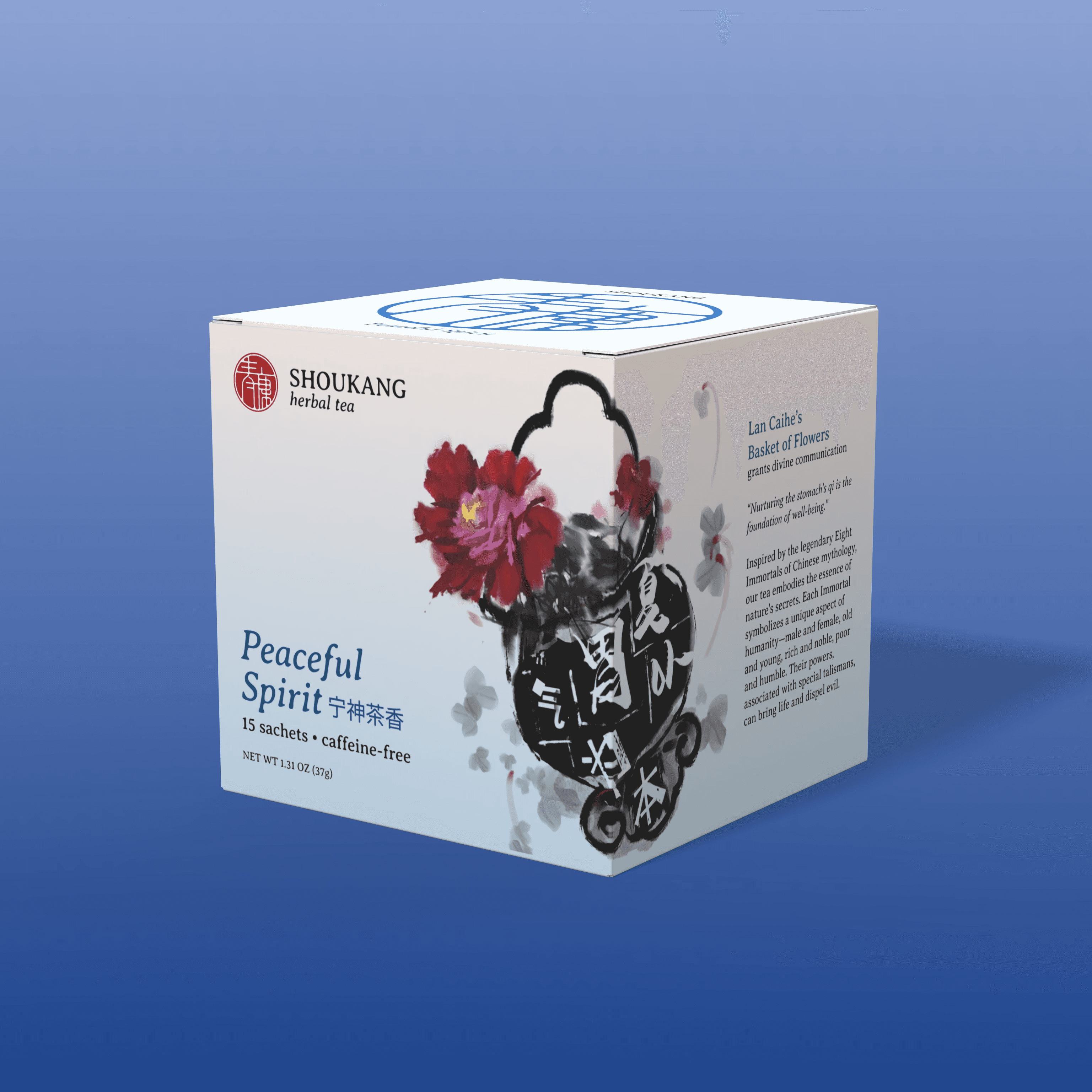
In Chinese mythology, the Eight Immortals are symbolic guardians of health and well-being. They are believed to have imparted their knowledge of healing herbs and methods to humanity, aligning them with the goals and principles of traditional Chinese medicine. These legendary figures are deeply woven into the cultural fabric surrounding health, healing, and longevity in Chinese tradition, perfectly aligning with Shoukang’s mission.
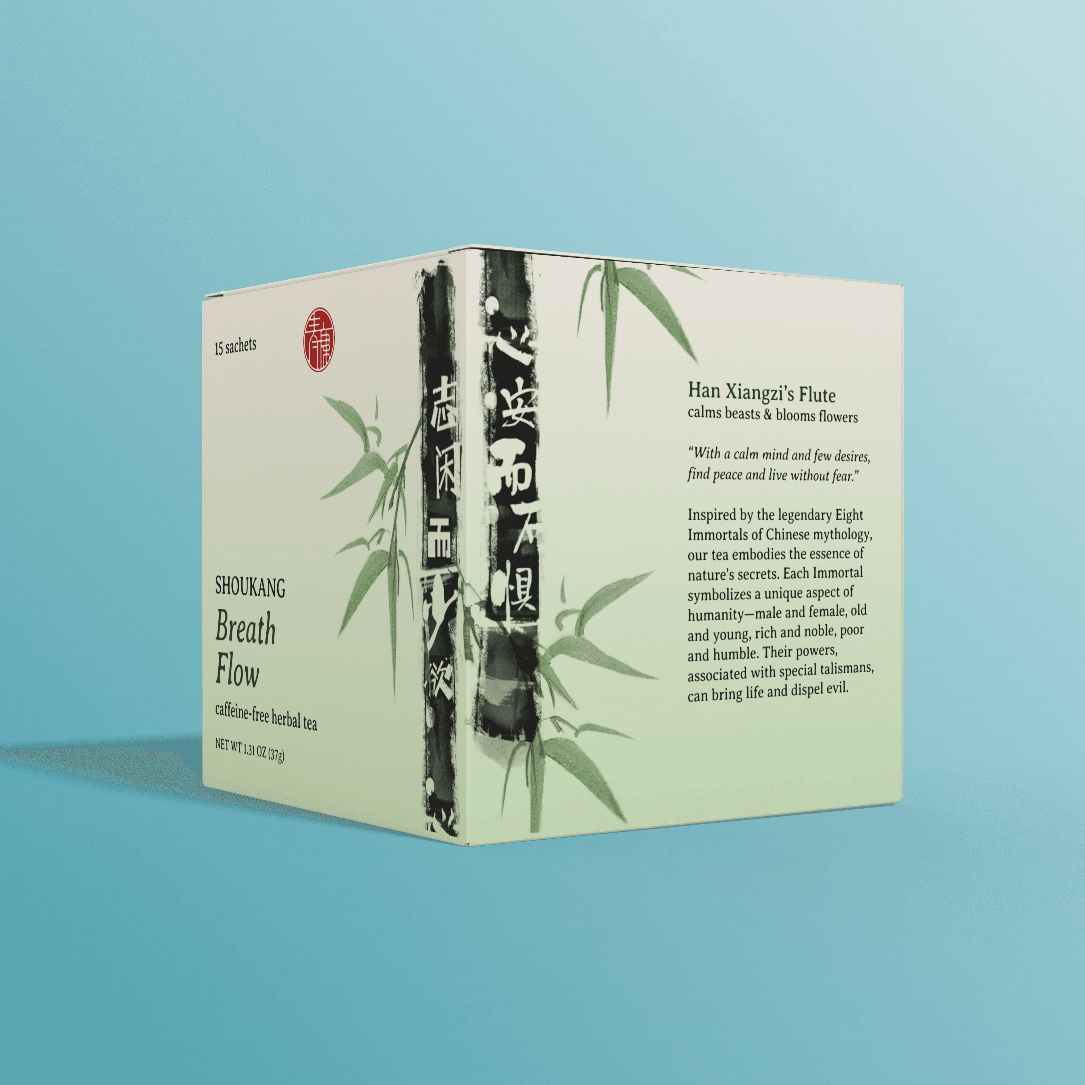
Symbolism & Storytelling
Each tea box highlights a different talisman from one of the Eight Immortals, creating a unique identity for each tea blend while maintaining a cohesive brand image. Each talisman is then paired with a phrase related to health from "Words from The Yellow Emperor's Classic of Medicine," one of the foundational texts in TCM. This approach connects the ancient wisdom of TCM with the symbolic power of the Eight Immortals, effectively communicating Shoukang’s brand to consumers.

Design Aesthetics
The logo is designed to resemble traditional Chinese seals, and the talisman art is rendered in the style of Chinese ink brush painting. The rest of the package is minimalistic, featuring timeless typography and a soft pastel gradient background to evoke tranquility and peace. The final design strikes a balance between traditional and modern elements, resulting in an elegant appearance that resonates with both cultural authenticity and contemporary aesthetics.

Feedback & Iteration
During the design process, I received constructive feedback regarding the visibility of the brand name. Initially, "Shoukang" was less prominent, which made it harder for consumers to recognize the brand at a glance. The critique pointed out that the brand name needed to be larger and more visible for effective branding. In response, I made a pivotal design change: moving the brand name to the top of the packaging and clearly separating it from the tea blend name. This adjustment not only enhanced brand visibility but also created a cleaner hierarchy that allowed the varieties to stand out without overshadowing the identity of Shoukang.
Additionally, I increased the text size for all elements on the packaging to improve accessibility. This change ensures that the design is not only visually appealing but also more readable for a wider audience, supporting both aesthetic and functional goals.
v1

v2


What I Learned
Throughout the process, I gained valuable experience in justifying my design decisions to stakeholders. From explaining the rationale behind the brand's placement and visual hierarchy to defending the balance between tradition and modernity, I learned how to effectively communicate the why behind my choices. This skill was key in aligning the final design with both the company's goals and consumer expectations.

Impact
This design tells a story of health, healing, and the transmission of ancient knowledge. It reflects Shoukang’s commitment to creating products that are not only effective but also deeply rooted in the rich traditions of Chinese culture. Since launching the new Shoukang tea packaging, the average monthly sales increased by 30%.